Hamza
April 8, 2026
0 Comment

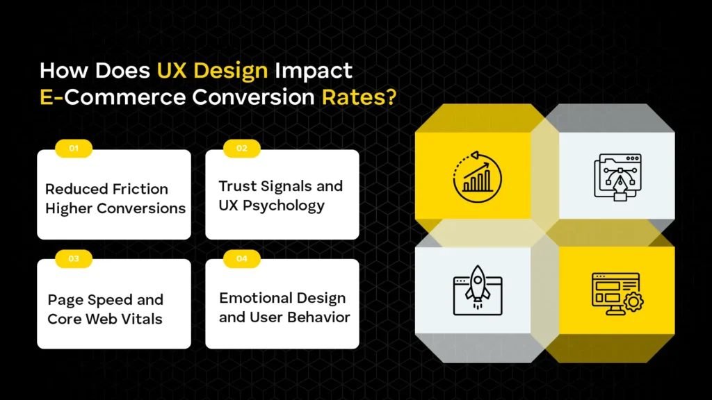
For years, e-commerce design was treated as a digital storefront—a place to display products and provide a “Buy” button. However, as we move through 2026, the industry has undergone a radical shift. Design is no longer an aesthetic layer applied at the end of development; it is the core engine of Conversion Rate Optimization (CRO).
The hard truth is that most e-commerce stores fail not because of poor products, but because of poor experiences. A user might love your brand, but if they cannot find the “Filter” button on their phone or if your checkout requires a five-page registration, they will leave. In 2026, attention is the most valuable currency. If your UI/UX creates even a micro-second of cognitive load or frustration, the customer is only one swipe away from a competitor.
Data-backed insights show that companies prioritizing advanced UX see a lower Customer Acquisition Cost (CAC) and a significantly higher Lifetime Value (LTV). Furthermore, Google’s search algorithms have evolved to prioritize “Page Experience” signals more heavily than ever. This means your UI/UX is now directly tied to your SEO, your brand authority, and, ultimately, your bottom line.
Discover how modern UI/UX design impacts your rankings and conversions. Learn proven strategies to turn visitors into buyers.
User Interface (UI) is the visual language of your store. It includes everything from the buttons users click to the spacing between images.
The “minimalist” trend has matured into “intentional design.” A clean interface isn’t about having a white background; it’s about removing anything that doesn’t lead the user toward a purchase.
Consistency breeds trust. If your homepage feels like a high-end boutique but your checkout looks like a 2005 Windows prompt, the user will feel a “trust gap.”
If a customer can’t find it, they can’t buy it.
Online shoppers don’t read; they scan.
User Experience (UX) is the internal feeling a customer has while interacting with your store. It’s the difference between a “smooth” transaction and a “clunky” one.
Friction is anything that slows a user down. Examples include:
In a digital world, trust is fragile. UX design must proactively build it.
UX and SEO are now two sides of the same coin. Google’s Core Web Vitals—specifically Largest Contentful Paint (LCP) and Cumulative Layout Shift (CLS)—measure how fast and stable your UI is.
Colors evoke feelings. Blue signals trust; red can signal urgency (or errors). Effective UX uses “Persuasive Design”—subtle cues like countdown timers for limited-time offers—to nudge user behavior without being intrusive.
If you want expert-level optimization to ensure your design translates into higher search rankings, explore our E-commerce SEO Services Dubai.
In 2026, “mobile-friendly” is an outdated term. We are now in the era of mobile-first.
The majority of impulse buys happen on mobile during “micro-moments”—waiting for a coffee, commuting, or during a commercial break. If your site is just a shrunk-down version of your desktop site, you are losing money.
Google primarily uses the mobile version of your content for indexing and ranking. If your mobile UX is lacking (e.g., content is hidden to save space), your desktop rankings will suffer too.
Mobile users are easily distracted. Checkout should be a “tapered” experience:
When looking to dominate your local market, collaborating with a top-tier local seo agency ensures your mobile-first design is seen by the right people at the right time.
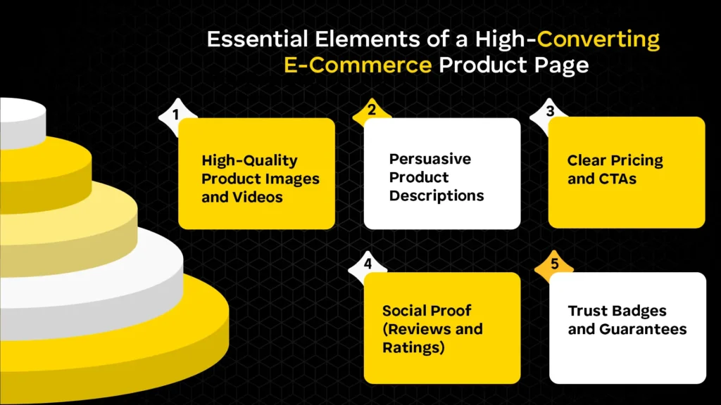
Since customers can’t touch the product, your media must do the work.
Don’t just list features; sell benefits. Instead of “Waterproof fabric,” try “Stays dry even in heavy rain.”
The price should be bold and unmistakable. If there is a discount, show the original price crossed out alongside the percentage saved. The “Add to Cart” button should be “sticky”—remaining visible even as the user scrolls.
User-generated content (UGC), such as photos of customers using the product, is 9.8x more impactful than influencer content in 2026.
Clear information on “Free Returns” or “2-Year Warranty” right next to the buy button removes the final “what if” from the buyer’s mind.
Not sure what’s hurting your conversions? Get a detailed UX and SEO audit tailored to your online store.
The checkout process is the most delicate part of the funnel.
Site search users are your most valuable customers—they have high “intent” and are 2-3x more likely to convert.
Accessibility (A11y) is about making sure everyone, including people with visual, auditory, or motor impairments, can shop on your site.
Micro-interactions are the “feedback” the website gives the user.
In 2026, SEO is no longer just about keywords. Search engines like Google use “user signals” to determine the quality of a page.
To stay ahead of these technical requirements, it’s vital to work with a partner like Alrwyt Alwash who understands the intersection of design and discoverability.
Partner with a results-driven team to optimize your UI/UX, improve rankings, and increase revenue.
In 2026, your e-commerce UI/UX is your most important salesperson. It works 24/7, greets every customer, and guides them toward the finish line. By focusing on mobile-first principles, reducing friction, and leveraging the power of AI-driven personalization, you aren’t just making a “pretty” website—you are building a high-performance conversion machine.
The most successful brands are those that treat UX as a continuous experiment. Small, incremental changes—like moving a button or clarifying a shipping policy—often yield the biggest ROI.
Focus on clean layouts, strong visual hierarchy, and consistent branding. Use whitespace effectively and keep navigation simple. Ensure users can find products quickly with minimal clicks.
Good UX removes friction in the buying journey. Faster load times and simple flows increase trust. This directly leads to higher conversions and lower bounce rates.
Most users browse and shop on mobile devices today. Search engines prioritize mobile-first indexing for rankings. A smooth mobile UX directly improves engagement and sales.
Include high-quality images, clear pricing, and strong CTAs. Write benefit-driven descriptions that answer buyer questions. Add reviews and trust badges to build credibility.
Reduce steps and allow guest checkout options. Use autofill and keep forms short and simple. Offer multiple payment methods for convenience.
Site search helps users find products instantly. Autocomplete and filters improve discovery speed. It significantly boosts conversions for high-intent users.
Follow WCAG guidelines for inclusive design. Use proper color contrast and add alt text to images. Ensure full keyboard navigation support.
They provide instant feedback for user actions. Subtle animations make the interface feel responsive. This improves engagement and user satisfaction.
Slow pages increase bounce rates and user frustration. Fast-loading sites improve rankings and retention. Speed directly impacts both UX and revenue.
Cluttered layouts and confusing navigation hurt usability. Slow performance and poor mobile design reduce conversions. Complicated checkout processes lead to cart abandonment.


